Fix Google AdSense Auto-Ads Layout Shift (CLS) by Reserving CSS Space
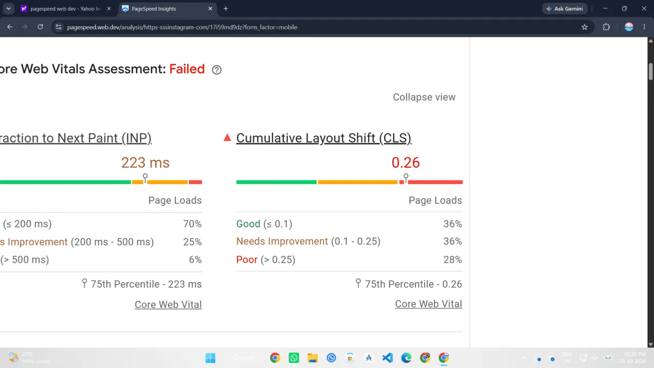
I was testing the performance of a new layout on PageSpeed Insights recently. My Core Web Vitals scores were perfect, right up until I enabled Google AdSense Auto-Ads. Suddenly, my Cumulative Layout Shift (CLS) score spiked into the red zone.
Every time an ad loaded, it forcefully pushed the main content down the screen. It is a terrible user experience, and Google heavily penalizes your search rankings for it. If you are struggling to hit that 100/100 CWV score because of AdSense, I am going to show you exactly how I fixed it.
Why do Auto-Ads ruin your CLS?
The problem stems from how Auto-Ads inject themselves into the DOM. When your HTML parses, the browser has no idea an ad is coming. A few seconds later, the AdSense script executes, downloads an iframe, and forces it into the page. Because the browser didn't reserve any space for it, the existing content gets abruptly shoved downwards.
We can't control exactly when the ad script runs, but we can control the CSS environment it loads into.
The Fix: Reserving vertical space with CSS
We need to explicitly define a minimum height for the container where we know AdSense will inject an ad. If you are using manual ad units, this is straightforward. If you are using Auto-Ads, you need to wrap the area where you want the ad to appear (like between the header and main content) in a dedicated container.
First, wrap your ad slot in a div with a specific class:
<!-- Manual AdSense ins tag goes here, or Auto-Ads injects here -->
</div>
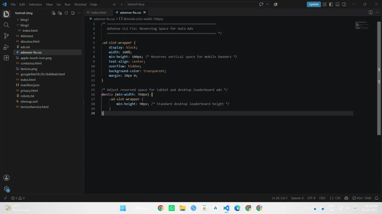
Now, apply a CSS min-height rule. You need to look at what size ads Google typically serves in that specific location. For a standard mobile banner, it is usually 100px or 250px tall.
display: block;
min-height: 100px; /* Reserves space on mobile */
width: 100%;
text-align: center;
overflow: hidden;
}
Handling Responsive Ad Sizes
If you use responsive ads, they will display at different heights depending on the user's viewport size. A mobile device might serve a 100px tall ad, while a desktop might serve a 90px leaderboard.
You can use CSS media queries to reserve different amounts of space based on the screen width. This ensures you aren't leaving massive empty gaps on smaller devices while still preventing CLS on larger screens.
.ad-slot-wrapper {
min-height: 90px; /* Typical leaderboard height */
}
}
If AdSense sometimes fails to fill the inventory and returns a blank space, you might see a lingering gap. I prefer keeping the gap rather than failing CWV. The layout stability is worth the slight visual trade-off.